
Lighting the Living Room: How to Showcase Layered Light in Your Portfolio
Lighting Design | September 22, 2026
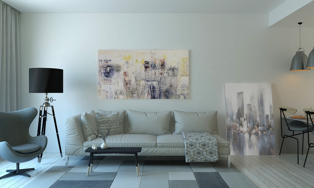
Ask any designer what transforms a living room, and lighting is usually near the top of the list. Yet in portfolios, lighting often gets less attention than furniture or color. That's a missed opportunity. A living room with thoughtfully layered light, ambient, task, and accent, looks different at every hour, and showing that range in your portfolio can set your work apart from designers who treat lighting as an afterthought.
Layered lighting is about more than adding a floor lamp next to the sofa. It's about creating pools of light that guide the eye, define zones, and shift the mood as the day progresses. In a portfolio, the challenge is capturing that layering in still images and explaining it in words without getting too technical for a general audience.
Photographing Light at Different Times of Day
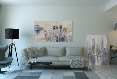
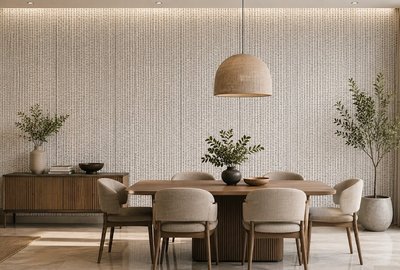
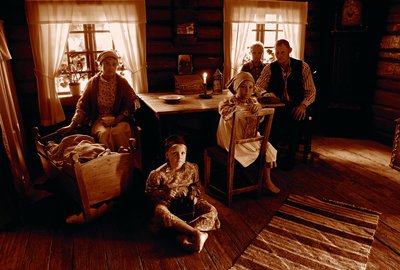
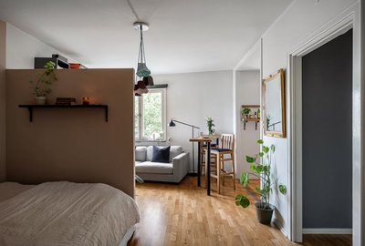
The single most effective way to show layered lighting is to photograph the same living room at two or three different times. Morning light through a window, afternoon light with lamps off, and evening light with every fixture turned on will each reveal something different about the space. If you can only manage two, choose one daylight shot and one evening shot. The contrast alone communicates that you thought about how the room works around the clock.
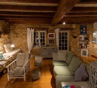
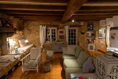
When shooting in the evening, resist the urge to turn on every light at full brightness. Real layered lighting is about variation. Some lamps should be brighter, some dimmer, and some areas of the room should be left in soft shadow. That's what creates atmosphere. If your camera struggles with mixed light sources, try shooting on a tripod with a longer exposure, or bracket your shots and blend them later. The goal is to capture the warmth of the room, not to make it look like a showroom.
Detail shots are useful here too. A close-up of a table lamp with a textured shade, or a wall sconce casting a pattern on the wall, shows the thought behind individual fixtures. These images give viewers a sense of the materials and the quality of light, which is hard to convey in a wide shot.
Explaining Your Lighting Strategy in Words
When writing about lighting, avoid jargon like "lumens" or "color temperature" unless your audience is technical. Instead, describe the effect. "We used three small lamps instead of one overhead fixture so the room could shift from bright for entertaining to soft for reading" tells readers more than a specification sheet ever could.
Explain how the lighting supports the way the room is used. If there's a reading chair, mention the adjustable floor lamp beside it. If the room is used for movie nights, talk about the dimmer on the overhead light and the warm glow of the sconces. These details show that you designed for real activities, not just for looks.
It's also worth mentioning any challenges. Maybe the room had no ceiling fixture and adding one wasn't possible, so you relied on plug-in sconces and lamps. Maybe the windows faced north and the room needed extra warmth in the evenings. Naming the challenge and your solution makes the lighting feel like part of the design story rather than an invisible layer.
Finally, consider including a simple lighting plan sketch alongside your photos. A floor plan with symbols for each fixture, showing where the light falls, can be a powerful addition to a portfolio. It demonstrates a level of planning that clients rarely see, and it gives other designers a practical reference they can adapt. Lighting may not be the first thing viewers notice in a living room portfolio, but when it's presented well, it's often the thing they remember.
-
How to Build a Living Room Portfolio That Feels Like a Home, Not a Showroom
Aug 31, 2026Design Fundamentals

-

-
The Client's Chair: Photographing Living Rooms That Show How People Actually Sit
Sep 26, 2026Small Spaces

-
How to Build a Living Room Portfolio That Feels Like a Home, Not a Showroom
Aug 27, 2026Color & Materials

-
Small Living Rooms, Big Ideas: Portfolio Inspiration for Compact Spaces
Sep 20, 2026Project Narratives

-

-
From Before to After: Using Transformation Stories in Living Room Portfolios
Sep 6, 2026Styling Tips

-
Lighting the Living Room: How to Showcase Layered Light in Your Portfolio
Sep 1, 2026Design Fundamentals

-
The Art of the Quiet Corner: Styling Reading Nooks for Your Portfolio
Sep 22, 2026Portfolio Strategy

Front Room Folio
Learn how to design and photograph a living room reading nook that shows off your attention to detail and cozy sensibility.