
The Client's Chair: Photographing Living Rooms That Show How People Actually Sit
Portfolio Strategy | September 7, 2026
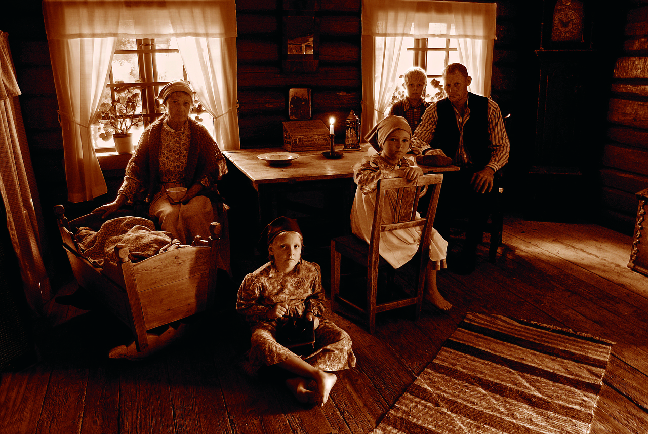
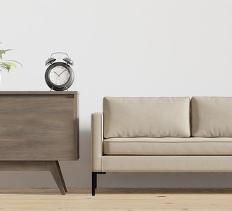
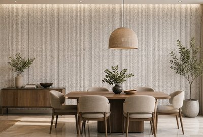
There is a particular kind of living room photograph that appears in almost every portfolio: the room is perfect, symmetrical, and completely empty of human presence. The cushions are plumped, the books are stacked, and the throw is folded with military precision. It is a beautiful image, and it says almost nothing about how the room works. The photographs that stay with clients are the ones where you can imagine sitting down.
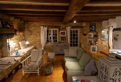
Staging a living room to feel inhabited is not the same as making it look messy. It is a controlled exercise in suggesting use. A throw draped rather than folded. A book left open on a side table. A chair pulled slightly out of alignment with its partner, as if someone just stood up. These small gestures cost nothing and transform a photograph from a product shot into a scene.
Staging the Signs of Life
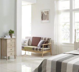
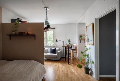
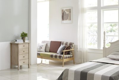
Start with the seating arrangement. Perfectly symmetrical furniture can look stiff on camera, especially in a large living room. Shift one chair a few degrees off-axis, or pull a stool slightly forward. The goal is not chaos but a sense that the arrangement is flexible and human. In photographs, this subtle asymmetry reads as comfort.
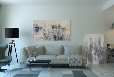
Next, address the surfaces. A coffee table with nothing on it feels like a showroom. A coffee table with a tray, two books, a small bowl, and a candle feels like a home. The trick is restraint: three to five objects, varied in height and material, arranged loosely rather than in a grid. Avoid placing objects in perfect rows; the eye reads order as artificial.
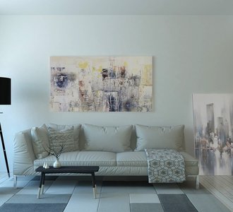
Textiles are the most powerful tool for suggesting habitation. A throw folded once and draped over the arm of a sofa, with the corner trailing toward the seat, implies that someone curled up there recently. A cushion that is slightly indented, achieved by pressing it with your hand before the shot, does more than any amount of styling. These details are invisible in a list but immediately felt in an image.
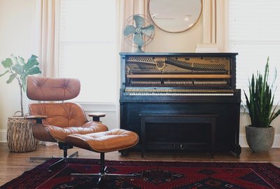
If the project allows, include a small sign of the client's life: a pair of reading glasses on a side table, a stack of magazines with a favorite title on top, a pet bed tucked beside a chair. These are the details that make a portfolio feel personal rather than generic, and they help prospective clients picture their own lives in the space.
Balancing Clean and Lived-In for Portfolio Shots
The temptation, especially for newer designers, is to go all the way in one direction. An overly styled room looks like a catalog; an overly lived-in room looks like a snapshot. The sweet spot is a room that is clearly designed but not precious, where every object has a reason to be there and nothing looks accidental.
One practical approach is to shoot the same room twice: once in a clean, composed state and once with the signs of life added. Compare the images side by side. You will almost always find that the second version is more compelling, and it will help you calibrate how much styling is enough. Over time, you will develop an eye for the minimum number of gestures needed to make a room feel alive.
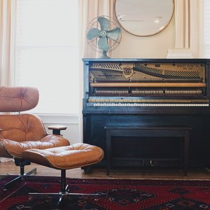
Finally, think about the story your portfolio tells. A client scrolling through your work is not just evaluating your taste; they are imagining their own evenings in the rooms you have designed. Show them a chair that looks like it has been sat in, a lamp that looks like it has been switched on, a book that looks like it has been read. That is the difference between a portfolio of rooms and a portfolio of homes.
-
The Client's Chair: Photographing Living Rooms That Show How People Actually Sit
Sep 9, 2026Portfolio Strategy

-
From Before to After: Using Transformation Stories in Living Room Portfolios
Sep 30, 2026Small Spaces

-
Lighting the Living Room: How to Showcase Layered Light in Your Portfolio
Sep 7, 2026Color & Materials

-
The Art of the Quiet Corner: Styling Reading Nooks for Your Portfolio
Sep 17, 2026Project Narratives

-
Rug First, Room Second: Why Flooring Choices Anchor Your Portfolio Shots
Sep 22, 2026Lighting Design

-

-

-
The Client's Chair: Photographing Living Rooms That Show How People Actually Sit
Sep 29, 2026Portfolio Strategy

-
How to Build a Living Room Portfolio That Feels Like a Home, Not a Showroom
Oct 4, 2026Small Spaces

Front Room Folio

Learn how to present living room projects in a way that highlights warmth and livability alongside your design skills.