
Rug First, Room Second: Why Flooring Choices Anchor Your Portfolio Shots
Design Fundamentals | September 16, 2026
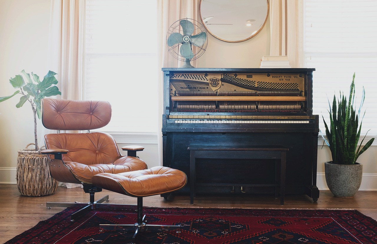
If you talk to enough designers about their process, you will notice a quiet disagreement about where a living room begins. Some start with the sofa, some with the artwork, some with a paint color they cannot stop thinking about. For portfolio purposes, though, there is a strong case for starting with the rug. It is the single element that most reliably holds a photograph together, and it is often the difference between an image that looks curated and one that looks assembled.
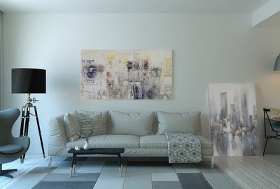
The rug sets the scale of everything above it. A nine-by-twelve in a modest living room tells a different story than an eight-by-ten, and the furniture arrangement follows accordingly. When you shoot a living room, the rug becomes the visual floor of the composition, a plane of color and texture that the eye reads before it reads the sofa. Get that plane right and the rest of the image has something to stand on.
Choosing Rugs That Photograph as Well as They Live
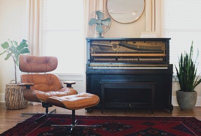
Flat, low-contrast patterns tend to photograph poorly; they blur into a single tone and leave the floor feeling empty. Rugs with visible pile, subtle sheen variation, or a defined border give the camera something to describe. A vintage Persian or Turkish rug brings built-in patina and irregularity that reads as warmth on camera. A chunky wool rug in a solid tone can work beautifully too, but only if the lighting catches its texture from the side.
Size is the most common portfolio mistake. A rug that is too small makes even a well-furnished living room look like a waiting area. As a rule, at least the front legs of every major seating piece should sit on the rug. In photographs, this creates a connected island of furniture rather than a scattered group of objects floating on hardwood. If the room is large, layer a smaller patterned rug over a larger neutral one; the layering adds depth that a single rug cannot provide.
Color is where the rug earns its keep. It can either echo the palette of the room or introduce the one note of contrast that keeps the image from going flat. A neutral living room with a muted rug can be beautiful but risks looking monochrome in photos. A rug with a deeper or warmer tone gives the camera a focal plane and gives the eye a place to rest.
Composing Portfolio Shots Around the Rug
Once the rug is in place, treat it as the stage for your furniture arrangement. In a typical living room shot, position the camera so the rug occupies the lower third of the frame, with the sofa or main seating group sitting comfortably within its edges. Avoid cropping the rug awkwardly at the frame edge; either let it run out of frame intentionally or show its full width.
Pay attention to how light falls across the rug. Side light from a window will reveal pile and pattern; overhead light will flatten it. If you are shooting in the evening, a floor lamp aimed across the rug will do more for the image than any amount of editing.
Finally, remember that the rug is also a practical choice your clients will live with. In your portfolio captions or case study notes, mention why you chose it: durability for a family, a low pile for a high-traffic rental, a washable flatweave for a home with pets. This turns a beautiful image into a piece of professional storytelling, and it shows potential clients that you think about how a room actually functions, not just how it photographs.
-

-
How to Build a Living Room Portfolio That Feels Like a Home, Not a Showroom
Aug 27, 2026Styling Tips

-
Small Living Rooms, Big Ideas: Portfolio Inspiration for Compact Spaces
Sep 21, 2026Design Fundamentals

-
Color Courage: Presenting Bold Living Room Palettes in Your Portfolio
Oct 4, 2026Portfolio Strategy

-
From Before to After: Using Transformation Stories in Living Room Portfolios
Sep 2, 2026Small Spaces

-
Lighting the Living Room: How to Showcase Layered Light in Your Portfolio
Sep 21, 2026Color & Materials

-
The Art of the Quiet Corner: Styling Reading Nooks for Your Portfolio
Oct 4, 2026Project Narratives

-
Rug First, Room Second: Why Flooring Choices Anchor Your Portfolio Shots
Sep 27, 2026Lighting Design

-

Front Room Folio
A strong portfolio is more than a collection of good rooms; learn how to sequence living room projects so each image builds on the last.