
The Art of the Quiet Corner: Styling Reading Nooks for Your Portfolio
Styling Tips | September 19, 2026
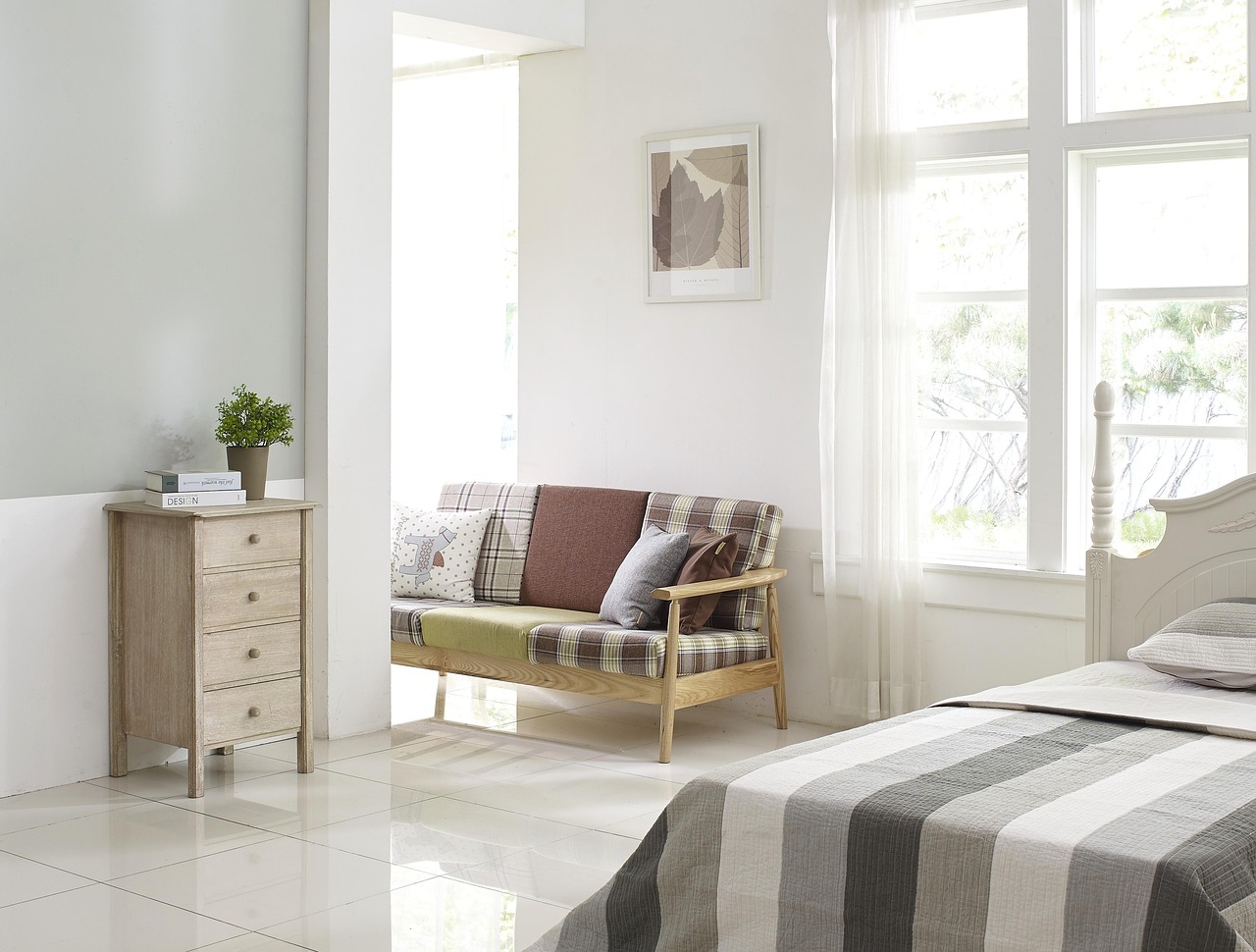
Every portfolio needs a moment of stillness. While wide shots of full living rooms show your range as a designer, a well-composed reading nook tells a more intimate story about how you think about comfort, proportion, and light. These small vignettes are often the images that linger with potential clients, because they suggest a life being lived rather than a room being staged.
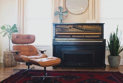
Start by choosing the right corner. A nook works best where two walls meet, ideally near a window but not directly in the path of foot traffic. In your portfolio shots, this translates to a frame that feels enclosed but not cramped. Position an armchair at a slight angle rather than squared to the walls; the diagonal adds energy to the composition and photographs better from most vantage points.
Building the Layers That Photograph Well
A reading nook lives or dies by its layers. Begin with the anchor piece, usually a chair with a distinctive silhouette. A rolled-arm lounge chair, a wingback, or a slipper chair each sends a different message, so match the piece to the story you want the project to tell. If the overall living room is tailored and modern, a softer chair adds welcome contrast. If the room is already relaxed, a structured chair keeps the nook from feeling shapeless.
Next comes the side table. Scale matters more than style here. The table should sit roughly at the height of the chair arm, close enough that a cup of tea feels within reach. In photographs, a small round table reads as intentional where a large rectangular one can crowd the frame. On top, keep it to two or three objects: a stack of two books, a small vase with a single stem, and perhaps a candle. Odd numbers and varied heights keep the eye moving.
Lighting is the third layer and the one most portfolios get wrong. A floor lamp placed behind and slightly to the side of the chair creates a pool of warm light that separates the nook from the wall behind it. Avoid overhead light in these shots entirely; it flattens the scene and kills the mood you are trying to sell. If the nook has natural light, shoot in the late afternoon when the sun rakes across the chair at an angle.
Photographing the Nook Without Losing the Room
The trick with nook photography is context. A tight crop of a chair and lamp is lovely but generic; it could belong to any project. Pull back just enough to include a slice of the surrounding living room, a bit of rug, the edge of a sofa, a hint of artwork on the adjacent wall. This tells the viewer the nook is part of a larger composition you designed, not a standalone set piece.
Shoot at seated eye level or slightly lower. Standing height makes nooks look small and uninviting, while a low angle exaggerates the chair and makes the corner feel generous. If you have a tripod, use it; the slower shutter speeds required for warm lamp light will reward you with cleaner images.
Finally, think about sequence in your portfolio. A reading nook image works beautifully as a palate cleanser between two larger room shots. It gives the viewer a breath, a moment of human scale, and a reminder that good living room design is ultimately about how a space feels at seven in the evening with a book in hand.
-
Rug First, Room Second: Why Flooring Choices Anchor Your Portfolio Shots
Sep 5, 2026Project Narratives

-
The Client's Chair: Photographing Living Rooms That Show How People Actually Sit
Aug 29, 2026Lighting Design

-
How to Build a Living Room Portfolio That Feels Like a Home, Not a Showroom
Sep 5, 2026Styling Tips

-
Small Living Rooms, Big Ideas: Portfolio Inspiration for Compact Spaces
Oct 2, 2026Design Fundamentals

-
Color Courage: Presenting Bold Living Room Palettes in Your Portfolio
Sep 23, 2026Portfolio Strategy

-
From Before to After: Using Transformation Stories in Living Room Portfolios
Sep 9, 2026Small Spaces

-
Lighting the Living Room: How to Showcase Layered Light in Your Portfolio
Sep 17, 2026Color & Materials

-
The Art of the Quiet Corner: Styling Reading Nooks for Your Portfolio
Oct 1, 2026Project Narratives

-
Rug First, Room Second: Why Flooring Choices Anchor Your Portfolio Shots
Sep 18, 2026Lighting Design

Front Room Folio
Discover why starting your living room design story with the rug creates stronger, more cohesive portfolio images.